Load Test Results Overview
Your load test just finished. You've got hundreds of thousands of transaction results (maybe millions), performance metrics across time, error logs, server resource data. What matters? Where do you start?
This guide explains the results interface: what you see, what it means, and where to look first.
What Happens When a Load Test Completes
After a load test completes, Load Tester automatically switches from live monitoring mode to results analysis mode. Three views, three purposes:
1. Load Test Results View (Live Monitoring)
This view runs during a load test. It's the operator's dashboard while the test executes: a grid of live charts updating in real time (the default is nine, configurable to 2 / 4 / 6 / 8 / 12 via the chart layout control), plus current/next step indicators driving the test forward. After the test ends, it persists with the final state visible, but for analysis use the Embedded Analytics Dashboard (below). The Results View's only practical post-test purpose is drilling into individual errors via its Errors tab, and that same error data is also surfaced in the Dashboard.
What you see:
- Summary section (top): Elapsed time, estimated duration, Report button, Dashboard button
- Live metric charts (middle): Users, Avg Page Duration, Max Page Duration, Total Pages Failed, Hits/sec, Pages/sec, Hits (cumulative), Bandwidth Out, Cases/min, all updating live during the test. The chart layout is configurable (2 / 4 / 6 / 8 / 9 / 12 charts) and any chart slot can be swapped to display a different metric.
- Current/Next Step indicators (bottom, during test only): Load level progression
- Errors tab (below charts): Drill into individual errors and compare recorded vs replay requests/responses
Why this view matters: While the test runs, you watch metrics here and intervene if something goes wrong (halt the test, adjust load levels). When the test completes, click Dashboard to move into the interactive analysis surface.
2. Navigator View (Test Results Tree)
The Navigator shows all your load test results organized chronologically:
Structure:
📁 Test Case Name
  ├── 📊 Load Test Result (2026-02-10 14:35) ← Most recent
  ├── 📊 Load Test Result (2026-02-09 11:22)
  └── 📊 Load Test Result (2026-02-08 16:45)
Why this view matters: Compare multiple test runs. Did the performance improve after your optimization? Did adding 2 web servers double capacity? The Navigator shows your testing history.
What to do: Double-click a result to open its report. Right-click for options (Open Test Report, Delete, Export).
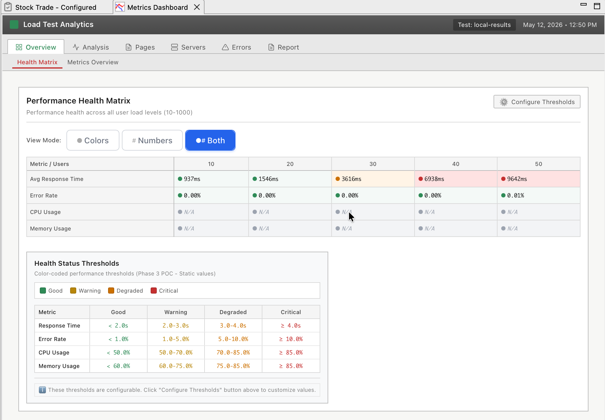
3. Embedded Analytics Dashboard (Interactive Analysis)
Click "Dashboard" in the Results View (or double-click a test in Navigator) to open the interactive analytics dashboard:
What you see:
- Interactive charts: Real-time metrics with zoom, filter, and drill-down
- AI-powered insights: Ask questions like "What's causing slow response times?"
- Health matrix: Color-coded performance health across all metrics
- Bottleneck detection: Automatic identification of CPU, memory, database, network bottlenecks
- Transaction drill-down: Click any page to see individual transaction performance
- Server metrics correlation: CPU, memory, disk, network overlaid with response times
- Error analysis: Interactive error timeline with filtering and AI explanations
Why this view matters: This is where you diagnose root causes interactively. The Results View shows symptoms (response times spiked), the Dashboard lets you drill down to find causes (database CPU hit 100% at 300 VUs).
What to do: Ask the AI "What's the bottleneck?" or drill down interactively: click charts to zoom, filter by time range, compare metrics.
The Three Views: When to Use Each
| View | Purpose | When to Use |
|---|---|---|
| Load Test Results View | Live runtime monitoring | During test (watch metrics, halt or adjust load), After test (error drill-down via Errors tab) |
| Navigator | Test history and comparison | Finding specific test results, Comparing multiple runs |
| Embedded Analytics Dashboard | Interactive analysis with AI | Investigating bottlenecks, Drill-down analysis, AI-powered insights |
| Legacy Reports | Static HTML for archival | Offline sharing, Archival, Executive PDFs |
Mental model: Results View is the speedometer (quick glance). Navigator is the filing cabinet (find your tests). Dashboard is the diagnostic lab (interactive deep-dive). Legacy Reports are the printouts (static snapshots for sharing).
Understanding the Results View Interface
The Load Test Results View has three sections, each serving a specific purpose.
Summary Section (Top)
Fields you'll see:
| Field | What It Shows | Why It Matters |
|---|---|---|
| Elapsed Time | Total test duration | Verify test ran for expected length |
| Estimated Duration | Configured test duration | Catch early termination (e.g., test stopped at 30 min instead of 60 min) |
| Dashboard button | Opens Embedded Analytics Dashboard | Gateway to interactive deep analysis |
| Report ▼ dropdown | Opens legacy static reports | For archival/offline sharing |
During an active test, this section also shows:
- Current Step: Which load level is active (e.g., "Ramping to 200 VUs")
- Next Step: What happens next (e.g., "Hold at 200 VUs")
- Next Step Begins In: Countdown timer (e.g., "4:32 remaining")
- Edit button: Modify running test plan (add/remove load levels)
Know what's happening now and what's coming next. If the test is holding at 100 VUs for 10 more minutes, you can grab coffee. If it's about to ramp to 500 VUs, stay at your desk.
Metric Charts Section (Middle)
The default live metric grid answers the critical operator questions while the test is running:
| Default chart | Question it answers |
|---|---|
| Users | What's the current load level? (Does it match the configured profile?) |
| Avg Page Duration | Is the application fast on average? |
| Max Page Duration | What's the worst case any user is experiencing right now? |
| Total Pages Failed | Are users seeing errors? (Should stay near zero) |
| Hits/sec | Is the server handling more requests as users ramp up? (If hits plateau before users do, the server has saturated) |
| Pages/sec | Same question as Hits/sec, but at page granularity |
| Hits | Cumulative hits since the test started (useful as a sanity check on throughput) |
| Bandwidth Out | Is the network saturated? (Should not plateau before user count does) |
| Cases/min | How many full test cases are completing per minute? (Indirect indicator of end-to-end throughput) |
Server-side CPU, memory, and disk metrics live in the Servers View, not in the Results View. The two views are designed to be watched side by side.
Chart controls (toolbar buttons):
| Button | Function | Use Case |
|---|---|---|
| Display Properties | Change number of charts shown (2 / 4 / 6 / 8 / 9 / 12) | Show more or fewer metrics |
| Chart Properties | Change which metric a chart displays | Swap "Bandwidth Out" for an OS-level metric, for example |
| Chart Maximize | Expand single chart to full view | Focus on one metric |
Your bottleneck determines what you watch. If database CPU is the problem, swap out "Bandwidth" (irrelevant) for "Database CPU" (critical). If you suspect memory leaks, add a Memory % chart.
Chart Interpretation: What "Good" Looks Like
Understanding chart patterns reveals performance behavior:
Response Time Chart - The Truth
Good (performance scales):
Response Time (ms)
200 |███████████████████████████████
    |
  0 +-------------------------------
    0  100  200  300  400  500 (VUs)
Response times stay flat as VUs increase. Server has capacity to spare.
Acceptable (linear degradation):
Response Time (ms)
600 |                      ██████████
400 |              ████████
200 |      ████████
  0 |██████
    +----------------------------------
    0  100  200  300  400  500 (VUs)
Response times increase gradually. Normal resource contention, still manageable (under 2000ms).
Problem (capacity exceeded):
Response Time (ms)
5000|                    ████
2000|                ████
 500|        ████████
   0|████████
    +----------------------------
    0  100  200  300  400 (VUs)
Response times spike suddenly at around 350 VUs. Hard limit reached: connection pool exhausted, CPU maxed, something broke.
Hits/Sec Chart - Server Throughput
Good (scaling linearly):
Hits/Sec
2000|                      ██████████
1500|              ████████
1000|      ████████
 500|██████
    +----------------------------------
    0  100  200  300  400  500 (VUs)
Hits/sec increases with VUs. Server can process more requests as load increases.
Problem (throughput plateau):
Hits/Sec
2500|        ████████████████████████
2000|    ████
1000|████
    +----------------------------------
    0  100  200  300  400  500 (VUs)
Hits/sec plateaus at around 2500. Server is maxed out and can't process more requests even though VUs keep increasing.
Errors/Sec Chart - Application Health
Good (zero errors):
Errors/Sec
100|
 50|
  0|════════════════════════════════
    +----------------------------------
    0  100  200  300  400  500 (VUs)
Zero errors. Application working correctly under load.
Problem (errors appear under load):
Errors/Sec
100|                    ████████████
 50|                ████
  0|════════════════
    +----------------------------------
    0  100  200  300  400  500 (VUs)
Errors start at around 300 VUs. Application is breaking under load (503 Service Unavailable, timeouts, etc.).
Ask the AI to Interpret Your Results
If you're not sure what your results mean:
I just finished a load test ramping from 100 to 500 VUs over 60 minutes.
Response times stayed at 200ms until 350 VUs, then jumped to 4000ms.
Errors started appearing at 350 VUs (503 errors). Server CPU was at 45%.
What's the bottleneck?
The AI can:
- Analyze chart patterns to identify capacity limits, degradation points, and failure modes
- Correlate metrics to diagnose root causes (e.g., low CPU + 503 errors = connection pool exhaustion)
- Explain what each pattern means for your capacity planning
- Recommend next steps (increase connection pools, optimize queries, add servers)
- Prioritize which issues to fix first (critical bugs vs. optimization opportunities)
Opening the Embedded Analytics Dashboard
The Dashboard is where interactive analysis happens. Three ways to open it:
Method 1: From Results View (During or After Test)
- Look at Load Test Results View (auto-opens during test)
- Click "Dashboard" button (top-right)
Use when: Test just finished, you're already looking at Results View.
Method 2: From Navigator (Anytime)
- Open Navigator view (Window → Show View → Navigator)
- Expand test case to see all load test results
- Double-click a load test result
Use when: Analyzing older tests, comparing multiple test runs.
Method 3: From Menu
- Window → Show View → Embedded Analytics Dashboard
Use when: You want the dashboard always visible (can dock it as a persistent view).
Legacy Reports Still Available
For static HTML reports (archival, offline sharing), click the Report ▼ dropdown and select "Legacy Report". See Legacy Reports for details.
What to Look For First
When results open, follow this triage workflow:
1. Glance at Response Time Chart
Question: Did response times spike?
- ✅ Flat or gradual increase → Performance good, likely no bottleneck
- ⚠️ Sudden spike → Capacity limit reached, investigate further
If flat, you're probably done. If spike, note the VU count when it happened. That's your capacity limit.
2. Check Errors/Sec Chart
Question: Are there errors?
- ✅ Zero errors → Application working correctly
- ⚠️ Errors > 0 → Application broken under load, investigate error types
If errors exist, open the Report and check the Errors section for error messages. 401 Unauthorized? 503 Service Unavailable? Error types reveal root causes.
3. Correlate Server Metrics
Question: Which server resource maxed out?
- CPU at 95%+ → CPU bottleneck (optimize code or add CPU capacity)
- Memory at 95%+ → Memory bottleneck or leak (optimize memory usage)
- Database CPU at 95%+ → Database bottleneck (optimize queries, add DB capacity)
- Bandwidth plateaued → Network bottleneck (upgrade NIC, add CDN)
Server metrics explain WHY response times spiked. Fix the resource that maxed out first.
4. Determine Capacity Limit
Question: How many users can the system handle?
Look for the VU count where degradation accelerated:
- Response times doubled at 200 VUs → Soft limit (degrading but usable)
- Response times spiked 10x at 350 VUs → Hard limit (broken)
- Errors appeared at 350 VUs → Failure threshold
If capacity meets requirements (say your target was 500 concurrent users and you got 600), you're done. If not, identify the bottleneck and fix it.
Next Steps: Deep Analysis
After the overview, dive into specific analysis tasks:
- Embedded Analytics Dashboard - Interactive analysis with AI insights (v7.0 primary interface)
- Understanding Metrics - What each metric means and how to interpret trends
- Performance Analysis Workflow - Step-by-step bottleneck identification
- Identifying Bottlenecks - Correlate metrics to find root causes
- Legacy Reports - Static HTML reports for archival and offline sharing
Or: If you found a bottleneck, jump to server-side optimization:
- Server Monitoring Introduction - Capture server metrics
- Server Performance Checklist - Diagnose infrastructure issues
Related Topics: